Days in the P.A.R.C
Following the excitement of the last week, it was back down to hard graft this week. On Wednesday morning, we had a lecture on Layout Principles. This involved copying down five pieces of information for a business card, before doing some thumbnail designs of layouts. I knew the morning was going to be a bad one when I had written upside down in my sketchpad. And not for the first time, I might add.
This was compounded when it came to creating our own. One of the pieces of information was a phone number, and, with my brain seemingly in a “power saving” mode went into automatic, and told my hand to write my own phone number into the design. These were then put on the wall for others to comment on. Obviously, Steve was the first to notice, but reassured me when he said he had done it before himself. This mistake could have been summed up with a quote from my sister, that quote being “MUUUUUH”. After a categorical yet well deserved humiliation in front of everyone, we continued the lecture.
From the lecture we learned about C.R.A.P, or, for the more politically correct, P.A.R.C. This stands for proximity, alignment, repetition and contrast. These are the key elements of page layout, and must be used in the correct way to create good design. I found the lecture very informative, as I have not learnt about what the correct way to go about design is yet, and I believe it will help me improve my next set of screen designs. This is exactly the kind of lecture I needed, as I can now use some theory to justify future design choices, especially in the A3 assignment.
During Wednesday afternoon I had my feedback session for my first assignment. This explained, among other things, why I had to buy a coffee for John, but more importantly the areas which I had to improve for the next assignment. These included time planning, screen designs and recording influences in my sketchpad. During the evenings study time I took this on board and made my own long term time plan. This really clarified what needed to be done when, and I would recommend everyone else to create one. Now that I can see that I only have a couple of sections to do each week, I can concentrate solely on these knowing that I do not have to worry about the parts further on in the semester.
Thursday morning started with another lecture, this time on colour space. This is the process of recording colour for use in documents. I found that this clarified some issues that I have not understood from using Photoshop, like what the Pantone palette is, and what specialist palettes such as Hexachrome were for. I am only really familiar with using RGB myself, so my knowledge was certainly expanded into new and interesting areas with the morning’s work.
During the afternoon, I continued to work on my A4 project. I now feel that I am starting to learn the process of generating work, rather than just doing bits here and there. Having a clear plan definitely helps, and is keeping me focused and stopping me from worrying about if I can fit in the work or not.
In self study over the past week I have done a couple of creative projects. Firstly, I took up Rob’s challenge to create a Designer Republic-esque piece of design/art. I say design/art, as I believe it is impossible to say if each one is totally independent. This has been the subject of much debate in the classroom, as well as in the Designers Republic essay which we have been doing for the A4 assignment. Anyway, my piece of work can be seen below.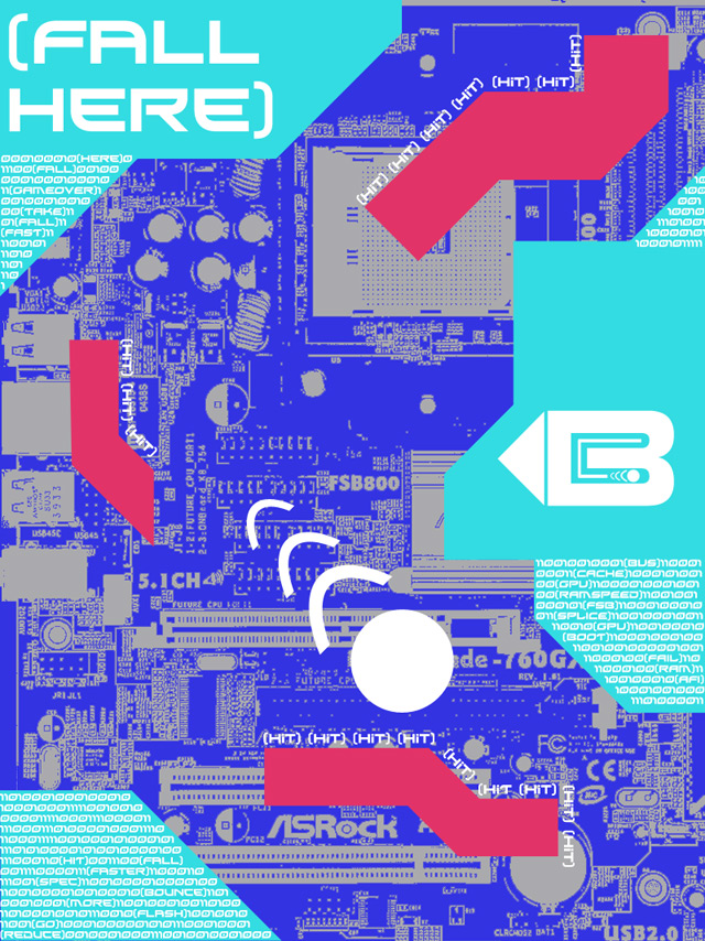
After doing this piece, I now have a better appreciation of how much depth the Designers Republic pieces have. Although I pretty much let my creativity run along on its own with my design, I now understand that the Designers Republic work takes a lot of experience with Photoshop to create a high quality result. I have only been using Photoshop for around 5 months, so I think it is justified if my interpretation is not up to the same high quality as the professionals at the Designers Republic. Irrelevant of the outcome, I still enjoyed the creative learning enlightenment.
In relation to next weeks lecture on image compression, I have been using different movie codecs to create a small video by using Adobe Premiere Elements 2.0. Although not directly related to web or print designs, this taught me a lot about the importance of file size, and how a balance has to be struck between this and quality. I found that some formats were better than others, and that only a small change in bit rate could make a big difference to the file size.
Some codecs looked very good, while others produced huge amounts of ghosting, and usually this created colour blur as well. I finally settled for an .avi format converted to .mp4 format using an excellent free Ipod movie converter called Jodix. The file size difference between 34-bit sound and 32-bit was as much as 15%, even though there was not much difference in fidelity. I believe that grasping this balancing act will become relevant for creating images suitable for web use. Anyway, my video (should) be posted below.
![]()
4 comments:
As Steve knows, I ain't the biggest fan of the designers republic artwork! But your attempt is exactly the same kind of style as on the website and I wouldn't be able to tell the difference between your work and the designers republic, nice work
Yes, that is very good Chris is right, you'd be really clever to be able to tell the difference between yours and the Designers Republic.
Are you going to take up the next challenge? This has just reminded me of that. I'll give it a bash when I finally get a free moment!
Thanks for your comment guys!
I do think that the picture I made is in the same style as the DR work. I don't think it's quite as detailed, but it is along those lines.
My favourite part is the 'B' symbol at the right hand side of the screen. I like the way it takes some of the angles and elements out of the main part of the picture and uses them as part of the design.
What does anyone else think?
I disagree, I don't think it looks very TDR. It's still good, I like it, but there's something missing from it that doesn't make it look like one. Maybe it's the detail like you said. You've got the style down though.
Post a Comment