Thursday, January 25, 2007

Starship Trooper

This week has been about getting back into the swing of things. I found self study over the past week difficult, as I was continually putting off Dreamweaver, and was finding it hard to collect information on A6. I know that I have been slow getting back up to speed with the work, as my sorry looking sketchpad shows. I think that to improve it I need a lot more of an experimental approach, more like and art course than a design course.

In my assignment feedback meeting on Wednesday I had a debrief with Steve over the last assignments. I thought that the process of the last was going too well, and soon discovered that I’d made the rather stupid mistake of not putting my name on the assignment sheet. Muuuuuh! [Nel Dyer, 2007].

Steve and I discussed the sketchpad work, which at the moment is holding me back from getting higher grades. I will be doing a couple of sessions with John on ideas generation, which is what I struggle with the most. I am use to creating something from a vision, rather than creating several possible outcomes from a range of initial ideas. As usual, I am probably over complicating the process, as I think that sometimes doing something quick feels like “cheating”, for want of a better word. A bit like doing homework the night before, like you did at school.

In the afternoon our group had a feedback meeting, where we discussed Dreamweaver, A6 handouts and CSS. The general feeling within the group was the Dreamweaver was a bit of a black art, and not as simple as it should be. We all agreed that the best way to work was to create something, test it in both browsers, and then repeat the process again and again. This would allow you to know what elements were creating problems, and thus the design process next time could be tailored to make implementation easier.

Thursday was a chance to research more into our A6 typographers, in my case Neville Brody. Enviously, James had acquired some rather large books on Neville Brody, which are pretty rare and would have been invaluable to my presentation. I think for my slides I will be using a PDF, and will keep the design clean and simple, and will make the presentation easier as I only have to press an arrow key to move between slides.

I bought some books on typography, those books being Get it right with type [Squire] and The complete guide to digital type [Ellison]. Both books were about a tenner, and contained advice on areas such as how to set out type, and also how to create attractive headers. Both books contained information on both print design and web design.

I have already started to plan the kind of things I want to do over the summer holiday, as I think this would be a great time to do some learning, without the stress of deadlines and time limits. I believe I will have to force myself to learn HTML in more depth, as at the moment it’s still a mystery to me. I’m usually bored of the holidays within 5 minutes, so creating a list of things to learn will keep me occupied and provide educational value seems a smart thing to do.

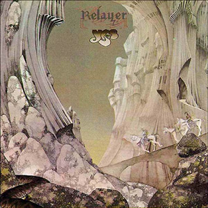
P.S If you’re wondering about the title, it’s a Yes song.

Monday, January 22, 2007

FTP = 0wn3d

Just a quick update regarding FTP. After a week or so of endless frustration I finally got my FTP working. The problem was that Passive Mode was enabled, and for some reason this was not letting me upload files.

It may be of note that itunes can sometimes stop FTPs from working, so if you are having problems try disabling them in the task manager.

Now I can finally upload things without moving from PC to PC, I can get on with experimenting with Dreamweaver. Woot!

Saturday, January 20, 2007

Perpetual Change

After a moderately enjoyable Christmas it was back to college to collect new assignments, and pick up results from the last semesters projects. To my surprise, I had gained a merit in the computing fundamentals unit, and a pass for the A4 Picture This assignment. I was pleasantly surprised that I had gained a merit, but I still don’t fully understand why. I felt relieved to have passed these assignments, as I didn’t want to have to re-edit previous work while tackling the new assignments.

During Wednesday afternoon we were given the A5 builder assignment, in which we must make the website which we planned in A3. I cant say that I was looking forward to this, because I really wasn’t. I have never used Dreamweaver before, but I know how difficult it can be for web pages to display correctly. We were shown how to set up Dreamweaver and use the basic controls. This will at least allow me to get started on something, and I guess I’ll have to take it from there. After having a very frustrating experience setting up my web hosting, I really feel that my patience for creating web pages is already pretty short, even before trying to implement a design. I can only see my fuse getting shorter as the assignment goes on, and the pressure starts building.

On Thursday we received the Revert To Type A6 assignment. To me, typography choice seems pretty subjective, and a bit of a dark area. I can’t really look at something and say “that typography is wrong” unless it is something blatant like incorrect leading or some tacky font which clashes at certain sizes. I’m hoping that over the next few weeks we are shown some examples of both good and bad typography so that we can see how to do it right.

Sometimes I feel that we are not shown enough examples of design where we have it explained to us why it is good, or why it is bad. I think on a course with some many visual learners on that this would be the most effective way to show us how to do stuff. I believe we have to be shown how to do things one before we can replicate and apply it to a new scenario.

Out of the two assignments, I really can’t pick which I will be dreading the most. Learning a new program like Dreamweaver and the associated languages, or doing many tightly timed pieces of typography pieces, with a presentation and timed exam at the end. I really won’t be entertaining the “put a positive spin on it” comments which I’m certain to receive. Looks like this semester will be all about attrition than ambition.

The typography lecture threw up some interesting fonts, during which I mentioned the artist Roger Dean. There are some of the Yes album covers which he designed below.

Monday, January 01, 2007

I'm InDesign

Within hours of finishing college for this semester, I was back to working on outside projects. Having had to cut back on these due to the approaching deadline day, I had a backlog of movies to create, as well as the Auto Sim Sport article.

I had been creating this article for several reasons. Firstly, I wanted to learn how to use InDesign, so that I could see if it was a marked improvement over PageMaker. I actually found it easy to pick up, as a lot of the controls which we use when putting the assignment into the template were available in the program too. I did actually plan out the article to an extent, by brainstorming what people would want to know about Photoshop, and what problems they were likely to encounter.

Actually writing the tutorial was all done on the fly. This is to say that I made the product, and wrote steps on it as I went. I had to remember that my target audience (which was Photoshop novices) would not have any knowledge of how the program worked. This lead me to creating a step by step guide, telling the user click for click what they had to do, and warning them of simple mistakes they could make.

I found that the photo restoration and banner design tasks which we did in class helped to highlight common problems people would come across, which made me aware of how different people interpret information.

As I enter the final stages of completing this document, I feel that I have created a professional looking piece of work, especially considering that I started it before we had looked at PARC and had the lectures on typography. As with any project, there are areas where improvements could have been made. Most notably, I think that my choice of fonts could have been better. I should have chosen a lighter font for the steps, and maybe highlighted notes in a different font. At least I can say that the choice and use of fonts is consistent through the document, having set up certain styles for certain parts of the document.

As the document is around 103 pages, with a few small areas to finish, I will want to know if my effort has been worth it. I may set up an e-mail account so that people can send me feedback directly related to the article, so that I know which areas could have been better, in case I decide to do another tutorial.


As I look to starting the second semester, I am starting to feel more anxious about the result of my last two assignments. I feel that they went more smoothly than the first assignment, but that does not in any way mean that I will have met all the right criteria to get a pass. I am also not looking forward to actually creating my website, as I have no experience other than this blog in web authoring. I am hoping that the tutorial will outline exactly what I need to do, and that Dreamweaver is relatively intuitive to use. I don’t usually look forward to the process of learning, but I can’t wait to gain the skills. I guess I’ll just have to endure one to be rewarded with the other.

I have recently been toying with the idea of buying a digital SLR camera. I don’t know weather this would be a worthwhile investment, or if I’d just spent my time taking pictures of the cat. I have been looking at the Deviant Art website, which contains a huge archive of peoples work, from a variety of media. This also contains web layouts which people have uploaded pictures of, and would make great inspirational work for sketchpads. I enjoy doing image manipulation, and a digital SLR would open new avenues for graphical work.

A happy new year to all avid readers of my blog, and I hope that 2007 brings as good a fortune as the back end of 2006 did. I will keep you informed of how the magazine article goes, and possible professional work (for real wonga!) which I may be doing in the future.