Perpetual Change
After a moderately enjoyable Christmas it was back to college to collect new assignments, and pick up results from the last semesters projects. To my surprise, I had gained a merit in the computing fundamentals unit, and a pass for the A4 Picture This assignment. I was pleasantly surprised that I had gained a merit, but I still don’t fully understand why. I felt relieved to have passed these assignments, as I didn’t want to have to re-edit previous work while tackling the new assignments.
During Wednesday afternoon we were given the A5 builder assignment, in which we must make the website which we planned in A3. I cant say that I was looking forward to this, because I really wasn’t. I have never used Dreamweaver before, but I know how difficult it can be for web pages to display correctly. We were shown how to set up Dreamweaver and use the basic controls. This will at least allow me to get started on something, and I guess I’ll have to take it from there. After having a very frustrating experience setting up my web hosting, I really feel that my patience for creating web pages is already pretty short, even before trying to implement a design. I can only see my fuse getting shorter as the assignment goes on, and the pressure starts building.
On Thursday we received the Revert To Type A6 assignment. To me, typography choice seems pretty subjective, and a bit of a dark area. I can’t really look at something and say “that typography is wrong” unless it is something blatant like incorrect leading or some tacky font which clashes at certain sizes. I’m hoping that over the next few weeks we are shown some examples of both good and bad typography so that we can see how to do it right.
Sometimes I feel that we are not shown enough examples of design where we have it explained to us why it is good, or why it is bad. I think on a course with some many visual learners on that this would be the most effective way to show us how to do stuff. I believe we have to be shown how to do things one before we can replicate and apply it to a new scenario.
Out of the two assignments, I really can’t pick which I will be dreading the most. Learning a new program like Dreamweaver and the associated languages, or doing many tightly timed pieces of typography pieces, with a presentation and timed exam at the end. I really won’t be entertaining the “put a positive spin on it” comments which I’m certain to receive. Looks like this semester will be all about attrition than ambition.
The typography lecture threw up some interesting fonts, during which I mentioned the artist Roger Dean. There are some of the Yes album covers which he designed below.
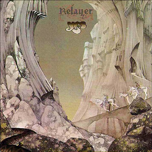

![]()
2 comments:
I agree Julian about being shown some examples of bad design. Even if it means our own but so far we have only seen a couple of business cards in passing.
I also agree that to make a site using Dreamweaver if you havent used it before is a big undertaking. It is one of those programs that you know what you want to do but cant seem to pull it off. A 'what you see is what you DON'T get' way of working.
I'm struggling myself with Dreameaver 8 as I have never used it before and I have used DW4 for years.
Maybe you will get your wish to see some bad design after this assignment.
Is there such thing as "bad" design? Sure, there's technically bad design which we're getting pretty good at spotting now, but surely by the very nature of it being designed it hasn't been designed badly, it's just that you (or someone else) doesn't like it.
As far as fonts being badly designed, I reckon that's the same. I think it's largely subjective too. It's not really about signifying which ones are bad and which ones are good, it's more about knowing when to use the right font for the right situation.
I know I love learning how to use new software, so how come you are dreading Dreamweaver?
Once you're on your way, I bet you love it.
Post a Comment