Thursday, March 29, 2007

Picture that…

For this weeks lessons I came prepared with a variety of sources to work through the day with. I had been looking for some stock images for my album cover, and planned to put together some quick sketches for each of the samples I had downloaded. This is just one approach I will be looking into for my album design. An example of this can be seen below.
On Wednesday morning we took part in a crit. session for our logo designs. I found that the feedback was good to obtain, but did not really dictate a clear winner. The feedback was positive about the electronic path which I had taken, which was apparent in all of my designs.

As I had to create a screen design for the following day, I needed to pick a logo design pretty quickly. I finally chose my ‘terminal jacks’ design, as it was the correct ratio, had a unique shape and kept its integrity at small sizes. I did however alter the colour to black, as the inverse colours made the logo look too childish. I did this to give it a stronger, more masculine feel, which would better suit the target market.

For my screen design I chose to keep a simple two column layout. I think that as this site is designed for others to work from, it has to be simple and easy to navigate and provide clear instructions. During our group’s feedback meeting, I found out that my website would be fairly easy to create in CSS, including the layout. Over Easter I will be putting some time aside to experiment with creating this. With a little help from Steve or John I believe this is an achievable goal, and will lead nicely into my self study for over the summer. My screen design is shown below.
Recently I have been working from the w3schools website. It is an excellent resource for all of the web based stuff, and it has easy to follow tutorials for lots of HTML, XHTML, CSS and more. They also have a feature where you can look at the code examples they give you, edit it, and instantly see the effect. You can find this at www.w3schools.com .

On Thursday afternoon I started putting together some ideas for business cards. I will be posting some examples of the designs over the next few days for a ‘public vote’. I believe that producing lots of the logos in Freehand and having lots of exposure with the DTP applications will be beneficial in the long run and also gives lots of evidence for the 1.2 and 1.4 learning outcomes. I find that every time I use InDesign I find some new tool to use, and this week’s was the ‘Align’ window. This allows you to select a group of objects and align them in different ways, much like the tool from Freehand. I’d encourage people to have a play in ID if they haven’t already, as it’s a very powerful tool for the corporate identity elements and is easy to make the transition to from PageMaker.

In Wednesdays lesson we found out our results for the A5 builder unit. I had achieved a pass in this, which I am fairly pleased about. As it was my first website, I wanted to concentrate on getting something that worked and to take in all the new information which I had to learn for the unit. Now that I have some of the basics, I am hoping to continue my web development in this A7 unit. Creating this website using CSS is going to be a big challenge, but I think if I shift a lot of the other stuff over Easter I should have enough time to concentrate on this when we return in a few weeks.

At the end of Thursday lesson we got the results for the Revert to Type unit. In this I received a merit, which I am really happy about. I think this grade came from collecting a lot of different examples of documents and annotating what I though of them, which is part of A2. I also did a lot of ideas generation for my presentation which helped to gain the M3 learning outcome. I also implemented my master time plan sheet, as well as planned all my tasks out, and this is part of the M1 section. It seems ages since we did this unit, and in this time I have already filled one sketch pad with sources and ideas generation, and am well into my second. I’m hoping that another merit will be on the cards for this unit.

Friday, March 23, 2007

Pen Tool Mule

The focus of this week’s activities centred on collecting resources for my album cover, and creating the logo for the record label. For the resources I took some pictures of different areas of the garden, including textures of various surfaces and pictures of interesting objects. After listening to the music I have decided that the album is more ‘Spring’ than it is ‘Russian’. I believe taking influences from nature may be the most constructive way forward.

Another part of my resource collecting included scanning various objects, many of them linked to electronics, music or in some cases both. This proved to be invaluable as my logo design has taken an electronic influence, with me putting electrical symbols and shapes into my rough drawings. On Thursday’s lesson I had a brain wave, and took one of the interesting shapes which I had scanned in and used it to form an Ambient World logo. The object (which was a speaker terminal cross over) was triangular, and had various shapes stamped into it. The object and the development of my logo can be seen below.
After various alterations to the orientation of the shapes, and some chopping and changing of parts, I eventually made an outline which was well within the 1:1 to 2:1 ratio needed for a logo. I also experimented with some colours which I picked from another scan I did. I had inversed the colours, and this gave it a glowing, electrically charged look which I thought was appropriate for an electronic music label.

I found that using Freehand was fairly simple. It has controls that are fairly similar to Photoshop’s pen too, but I certainly missed the convert point tool which allows you to bend the 2 axis on any given point. I am thinking that for my album cover I could combine both a bitmap image and a piece of vector work to go over the top. This is a technique that I have seen many times in pieces of digital artwork, such as the DR posters and in Photoshop magazines. I think doing some ornate foliage based vector work could be something which I could carry through all of the CD, from the cover to the booklet and CD label itself. I will source some pictures for my sketchpad to demonstrate this.

Over the next week I will be creating my 4 logo designs in Freehand, as I think that getting as much experience as possible with this program will be useful – even if some of my logos are discarded. I will also be putting together some initial rough sketches of the website which we have to create to show our style guide. I believe this will take a simple form, as I still have a lot of technical web related stuff to learn before I can create professional looking pages.

Friday, March 16, 2007

Logo Roco

After a refreshing few days break from doing assignments, it was back to the coalface on Wednesday of this week. In the morning we had a lecture on generating logos, an area which I didn’t think had so much theory to it. After break we had another ex-student visit us, and this time it was Marc Bowers. He showed us some of the work from the Real Radio website which he creates pages for. Once again, it was emphasised that the pace of work is pretty relentless – always something to keep you on your toes. After the exam at the end of A6 I can imagine how full on it must be to do that day in, day out. I'd like to thank Marc for coming in and sharing his experiences with us.

During the afternoon we received the brief for the new assignment, A7. This unit brings together all of the stuff we have done this year, from using Photoshop to creating web pages.

Firstly, we will have to design a logo for the Ambient World record label, and present it in a vector format. Secondly, we will be developing a corporate identity and style guide to be put into a web site. Thirdly, we will choose a Fax label album, and will be creating a CD booklet, inlay, body and pre-flight document for it. Finally, we will of course be creating an evaluation on our progress through the unit.

For this unit I am aiming to bring together all the elements from previous units. For my sketchpad, I will be continuing to put in lots of examples of both good and bad design, and annotating what I find. On the time planning front, I again have created a master time plan, and will add a recorded time plan to this. This document will allow me to note down how long particular tasks have taken, so that for future reference I can plan better. I will also be adding more research to my blog and sketchpad, as well as using more non-web sources, which I will make notes on in my sketchpad. A picture of one of the album covers and how I have annotated it is shown below:

On Wednesday evening I collected around 28 album covers to stick in my sketchpad and annotate. One observation that I have made is that many of them use uppercase typefaces. I believe this could be because album covers are fairly small, and people need to be able to see the name clearly when hunting through rack upon rack of CDs. I have also notices that many contain photographs as the base of their design. I don’t think using a photograph in my design will really push the envelope much, so I’ll have to create a full range of ideas from vector and bitmap based tryouts.

During Thursday we went over what should be included in the style guide. I like the idea of the style guide, as producing documents from them takes all the heavy lifting out of the design, yet each document you create looks consistent and professional. However, actually making the guide itself and removing any ambiguity from it will be a challenge. As this has to be presented in a web page, I will have to improve my skills for creating this. I am planning on learning some basic CSS, as I think this will make the creation of the page easier. I believe I will stick to a simple, clean and functional design to make the production easier.

On Thursday evening I managed to find some samples of my chosen CD (Pete Namlook & New Composers – Russian Spring) on Itunes – I have to say I really like it, and it is already formulating some ideas in my head. The music sounds quite airy and very listenable. I can’t wait to hear what it sounds like on the ol’ Quad.

Between now and next week I will be continuing to find resources, and may do some experiments with putting different materials onto the scanner and seeing what I can do with them in Photoshop. I will also be taking some photographs for more texture ideas, and probably pictures of the garden which could come in handy for my ‘Russian Spring’ album.

Sunday, March 11, 2007

A6 Unit Evaluation

In my feedback for the A4 assignment I knew that the typography unit would be essential for my design skills development. As some of the typographical elements of my A4 banner designs were not particularly strong due to a courier font being used. This type of font is usually the default font on a printer when no other font can be found, so it might be conceived as being an error in the printing process. In retrospect I should have used another typewriter font instead of courier.

At the start of the unit it was given Neville Brody as the typographer who I would have to do a presentation on. I initially searched the internet to find out the basic facts, before buying the Neville Brody design book to aid me in the construction of the presentation. I found that this book provided me with a wealth of information, and actually found it very difficult to cut down the information for only 5 minutes of presentation time. I decided to segment the presentation into a cross section of the work Brody had produced.

Firstly I decided to look at what influenced Neville Brody, before moving onto his early work. I discovered that key elements such as economy of design were apparent in the first pieces of work he produced. This was a theme I could keep referring to through out the presentation. I also looked at designs he did for products, as this would allow me to show how Brody used typography in different contexts. I think that this range of media gave the presentation more depth, and I should repeat this process when I do another presentation.

When the first task came I felt anxious about what we would be given. I found that I coped fairly well with the tasks, and doing a small amount of time planning for each one really helped me to set mini deadlines for the completion of each section. This ensured that I had plenty of time to evaluate my own work and make changes to areas which I felt uncomfortable with. As this method proved effective, I continued to use it through the other timed assignments. As everyone else was doing the same task, I found it awkward to ask for feedback, as I felt that I could not disturb them from their own work. I believe this was just a quirk of the format, but at least there were several points during both design and construction where I realised I would need feedback if this was a real life task. There were some feedback comments which I added to my roughs, but they did not match the depth I would want if the task had been real.

With the paint tube task I felt that the lack of knowledge about printing techniques limited how I could design the label. As I did not know the problems from being used with techniques such as using a reverse, my design was initially highly flawed. After these errors had been made clear, I was able to quickly redesign the label into something which worked. I was very impressed with the final design I made, as I used a mixture of sans-serif fonts for the technical data, and a display font for the name of the product. The font I chose (Isabella) gave the oriental flair which the design required, while being set at a size which could be read. I also chose a centre alignment, as the cylindrical shape of the tube would mean that the label would be obscured if the viewing angle was slightly offset to the viewer. I feel that this is one of the places which centre alignment is acceptable, as it easier to read and matches the alignment of the brand logo which we were initially given.

The next task was to create a Vodafone advert for a newspaper. Again, not knowing the limitation of printing on newsprint, I found it a challenge to make a design which would be acceptable. I decided to keep the design basic, which I feel is often the best option when designing under pressure. Once again I implemented some basic time planning, which allowed me to explore possible solutions, produce a document, then evaluate, redesign and reproduce an improved product.

One part of my design was to use symbols to provide a visual feature to the design. After gaining feedback from peers, many people thought that they were not correct. I strongly disagreed with his, as I felt that they added a more eye catching alternative to simply using bullets. My argument was that as it was for a creative job, the advert itself had to show more than just traditional elements, ie bullets, and that I should use symbols instead. I think I was right to stick with them, as at the very least it allowed me to explore the use of them. I believe that I should use them again in the future, but I will remain contextually sensitive and only use them where appropriate.
The last task was to create a grid for a newsletter, and then place some content into it. I designed my grid and header with a 3 column design. I thought that this gave enough flexibility, while giving coherence. I think that if we could have implemented more of a style guide, I could have used a 6 column layout, and then imposed rules such as only allowing text to go across 2 columns. This would have added flexibility, while providing structured guidelines to the project. I also reused the “skyscraper” design from the A4 assignment. I could do this because we were allowed to use stroke lines, which gave the same effect as using vector graphics like I did in the banner adverts. This shows that I took the interpretation of the brief and used it to get the most out of the design.

Again, I was impressed with the deployment of typographical elements. I used a drop cap, pull quote, and Brody influenced stroke lines to bring my design to life. If I was to change any part of the design, it would be the title, as I think it looked too playful for a document of this type. Changing to font to something like Franklin Gothic would have been better, as it would look more formal. I would also change the stroke lines on the folio into a thick/thin arrangement, as 3 separate lines looks to excessive.

On the day of our presentations I felt confident that I would be able to reproduce my presentation to a similar standard as in my practice. However, after my presentation I felt disappointed with myself that I had only done 4:10s, as before my presentation lasted 5:32s. I think that under the pressure I rushed parts of the presentation. Next time I think that I should learn some relaxing techniques so that the same does not happen again. My disappointment was compounded when I was asked a series of typographical questions at the end of my presentation. I knew many of them, but the tone and amount of time it took me to answer them did not make it convincing that I knew the answers. This was all my own fault as I had planned to revise them after my presentation, when I had several hours free before the final exam. I think that with the next units I will continually look at any theoretical terms we use through out the unit, not just when they are required at the end.

I was impressed with the look of the presentation, and I felt that the ideas generation was well done before my presentation. I did rough designs of the layout of the presentation slides, then did many roughs of the custom made titles, side bars and bullets that I would place on the page. This made production quick, as I could put the parts together in Photoshop then place them into the design.

For the final exam I felt a little better prepared, as I had taken time to learn some of the typographical elements. Again, better preparation in the weeks before would have aided me greatly in this, which I will ensure I do for the next unit. I thought that the brief and the time we were given was very challenging, but as outside projects using InDesign had taught me how to quickly put documents together paid dividends in this task. Again, I kept a simple design so that I could focus on the typographical knowledge.

I managed to get 3 pages done, each one filled with typographical terms. I found that using the layout itself to explain terms, with the aid of captions, quickly name checked many of the terms. I feel that the outside projects using InDesign were most valuable for this, and I pity those who had to do this complex task with any less InDesign experience as myself. I found it extremely difficult, and I was an early adopter of the InDesign program. I will certainly continue outside project to make me more proficient in using the programs on the course

In conclusion, I have thoroughly enjoyed this unit, even if the last day of it was slightly disappointing. I now feel very confident of creating professional desk top published documents. I found that collecting many examples and annotating them in my sketchpad helped me to visualise the real world use of all the theories we learnt, and I will endeavour to improve on this further for the next unit. Improvements for the future will include designing a document where I can record how much time it takes to do tasks, as well as recording when to do them. I will also continue to add more research to my blog and write about it in my sketchpad, as well as offer more feedback when people put their designs on their blog (as I did on Craig Burgess’s post including his newsletter design). For the last unit I want to bring together all the improvements in time planning and sketchpad work to really push for a good result in the final unit. I will be improving my work output so that I am able to do this over the remaining weeks of this year.
Wordcount: 1726

Friday, March 02, 2007

Keep pedalling

After returning from a busy and frustrating half term, it was back to the coalface on Wednesday morning. Over half term I had been focusing on my presentation, which became infinitely more difficult when the second Neville Brody book I had bought failed to materialise. I was incandescent with rage about this, and had to alter the focus of my presentation onto the earlier work covered in the first volume of the book. In a way it actually allowed me to explore in more depths Brody’s typography in different contexts, such as product design and article layout. More on the presentation progress later.

On Wednesday we had a visit from Jonny Haynes who talked through some of the work he had been doing at Technophobia. Although a lot of the stuff about CSS went over my head, I could see that the work he had done was to a very high standard, and appealed to me more than the Design Mechanics stuff from several weeks ago. It made me realise how much there is to learn between now and this time next year, and only made me more determined to do some comprehensive self study over the summer. I believe this is the only way I will be satisfied with the work I produce next year.

In the afternoon I continued to make amendments to my website. I altered the colour of the buttons on the pages which they corresponded to, as I had had one or two comments saying that people did not know which part of the site they were on. I chose white, as it highlights the text well and stands out against the darker surrounding colours. I should be uploading this over the weekend, should my shaky internet connection not let me down.

On Thursday afternoon it was our slot for the presentations. My group, consisting of Mirhad, Scott and myself went through our presentations in the order we were going to do them on ‘the big day’. I was of course first, and felt a bit more confident about the presentation than I did with the colour ones. I believe this was because I had a lot to say, having acquired a lot of research. Once I was about 6 slides in, Steve said “that’s 4 minutes” and I had to rush through the remaining slides. I believe this was because I was adding too much to what I was saying, and will have to cut it down slightly for the real thing. There were also a few errors on my slides which I will have to correct before next Thursday.

Overall the feedback I got was good, and Steve said that it was one of the better ones so far. Between now and next week I should learn exactly what I am going to say which is not on the slides, so that I don’t run the risk of going over the time limit of 5 minutes. I will also be making amendments to my handout sheet, as I now know it can be over a page long. I believe I will treat it as another piece of typography work for my folder, just to top up the examples of my typographic skills. Some of my slides can be seen below, along with my handout sheet. No pinching, James!

After we had done our presentations, we talked about our thoughts on the next unit and what our thoughts on next year were. With the next unit being heavily print based, I am really looking forward to it. I believe that finding out how to make document ready for being sent to a printers will be invaluable, and may encourage me to find clients for small pieces of work over the summer. Now that I have made progress with my time planning in A3 and A4, and my sketchpad work in A5 and A6, I think I will bring it all together for this last unit of the year, kind of a ‘swansong’ for the end of year one. If I aim for the higher grades and do well, I believe it will give me a great confidence boost for my self study work over the summer.

As for next year, I believe that it going to be a huge challenge for me. Not only does the quality of the work have to increase, but the learning environment is more focused on us. Again, I think with me planning self study over the summer will allow me to improve on these skills, and could make the second year a little easier to complete. I do feel anxious that I will find the more technical aspects hard to understand, and I know only hard work will get me through these. I guess I’ll just have to wait and see what happens.

In Jonny’s presentation on Wednesday, he mentioned the importance of creating work outside of the college environment. I’ve always been a believer that this is highly valuable experience, and have always given things a go, like the DR-esque picture I did, as well as various other projects. This week I decided to create a product movie for an acquaintance of mine, Todd Cannon of Cannon Simulation Technologies. This involved demonstrating one of his products, and creating a video to put on YouTube. This website is a great tool for small businesses, as it allows them to demonstrate products cheaply and get them shown to a large audience. Features such as embedding also allow them to be placed on their websites.

I decided to pool together a range of techniques, including my self taught and rather limited video editing skills, Photoshop skills and Typography work to make a “picture in picture” product demonstration. I used a digital camera to record the actions of my feet, and Fraps video capture software to record the action of the simulation. I brought these elements together, and then added the company logo (which I had remade in a larger format) and added captions which could be clear to read for viewers. As per usual, this was a variant of Myriad Pro. I also cut out a picture of the product, and added a glow effect to highlight it. Overall I was impressed with the quality of what I had made, but unfortunately YouTube puts the picture and audio out of sync in its own conversion process, which is rather annoying. Anyway, the video is embedded below. Watch me control 400bhp of simulated American muscle – in my socks.


Friday, February 16, 2007

Steely Don

A jazz related title, for a jazzy week and half term to come. First of all, I’ll go over last week’s A6 task, which could not be covered in the themed blog entry. This task involved creating an advert with the dimensions from a rate card, which are measured in Standard Column Centimetres. I decided to go width of 94mm by 160mm, as I felt the dimensions suited the text, and would allow me to split up the page into simple elements. The final design I created is pictured below.

I was very pleased with finished result which also warranted a “s’all right” response from Steve, which is praise indeed. One area which we disagreed on though was the use of symbols at the left of each paragraph. Steve thought that bullets would look more suitable for a document of this type, but I didn’t share his view. I thought with the business being a modern telecommunications company, advertising for a creative job role would look better with some small graphical touches. What would catch your eye more when sifting though job adverts? Boring black bullets or little symbols of a globe, a money bag, and a mouse?

On Wednesday of this week we did our usability tests, which we had to create a form for. I chose to use a “agree strongly/agree/disagree/disagree strongly” arrangement of questions, as well as some more open ended questions. I found it very had to pick these, as I wasn’t really sure what parts of my site needed to be highlighted for change, and I thought a lot of people felt the same.

After about 2 hours of testing we had got through everyone’s website. I would have to pick Drew’s site as my favourite, as it was annoyingly attractive and sickeningly easy to use. I found that looking at everyone else’s website highlighted that I have along way to go to get up to the same standard of design as everyone else. I certainly don’t feel I have the ‘knack’ for web design yet, where as with print I seem to naturally be able to drop things into the right places. This is why I’m implementing a HTML/CSS “boot camp” of self study over the summer, with some of the books which have been recommended to me by others, to improve my capability, and educate myself about what features I can utilise when designing a page.

On Thursday we did 2 tasks which combined together to produce one finished piece of work. This task was to create a newsletter heading and folio, and then as the second task put the content into what we had designed. With the first task I decided to redeploy my “skyscraper” design, as I could make it with heavy stroke lines within a couple of minutes. As we only had an hour to create the header and folio, I thought I would stick to what I know. I also used symbols for a moon, and some speech marks around the title.

I chose a 3 column design, and had the title spread across 2 columns, and the skyscrapers in the third. I also placed some black stroke lines in the folio, which has probably been influenced by the Graphic Language of Neville Brody book which I had been looking though for my presentation.

In the second task I decided to put the picture 2 columns wide, and put in features such as a 4 line drop cap, a pull quote and a by line. Once again, I chose the Myriad Pro font, which I really need to wean myself off before I use it on everything. However, I did find out here that it was good for dyslexics, so in my defence it was considered because of its usability merits. Overall I was pleased with the document, but I think my header and folio could have been done better. Lines should have been used more sparingly, and the arrangements of some of the symbols could have been better. This document is viewable below.

Over half term I will be creating the slides for my presentation, and producing my handout document. I’m looking forward to doing these, as I think I’m going to really push the creativity in the design of the slide headers, which are going to reflect the work of Neville Brody over the years as the presentation progresses. As for my handout form, I think I will be creating a strong black and white header in a similar style to his Arena work. No doubt I’ll find a spare hour one evening to do another blog post, and possible show off some of my slides. As long as James promises not to pinch them.

Friday, February 09, 2007

Team Roles

After painstakingly and conscientiously looking through the categories at www.belbin.com, I have decided that I fit into the Completer/finisher category. I think this because once I start a task, I relentlessly aim to complete all the work to a high standard. I also feel that I am rather conscientious about the decisions which I have made, and will always aim to change something I feel uncomfortable with. I believe this attention to detail allows me to find errors of fix problems in the work.

There are however some drawback to this style of workflow. I often do not trust people to do something which I could do to a higher standard myself. I always think that some people may not make as many considerations in their production as I would, and this can degenerate my faith in others. I also feel that sometimes I get very anxious about tough decisions, as there is always the “should I have done the other option?” question.

As for the other types of people I would want to work with, I think that balance is the most important aspect to get right. I believe I would need a “plant” type worker, as they could generate initial ideas, which we could then discuss on a technical and implementation level. This would allow us to make a website which is both technically and aesthetically viable, as opposed to creating a design which is hard to implement and would become contrived during production.

Secondly, I believe I would also work well with a co-ordinator type worker. This person would be able to set deadlines which I could then produce work to, so that the production would stay on schedule, and amendments could be made should difficulties arise. I also think that this person would be able to help me make crunch decisions which I would otherwise cause me to become anxious, and would be a great second opinion on such issues.

Thirdly I think that a Shaper would give our team the drive and determination needed to complete tasks. As we may have to work to tight deadlines, a shaper would be able to complete any task s in a short amount of time. As problems often occur with web design, combining this type of worker and a plant worker would allow us to be flexible should problems arise or clients want things changing on short notice.

In the past I have worked in group situations which have been successful. I think this is because I like to do a lot of the task myself, and I don’t really like relying on other people. I think that I have to become more willing to delegate roles to other people, as there will come a point where I simply cannot do all the tasks which would be set out.

Friday, February 02, 2007

InDesign, out of time

I must first apologise to my colleagues for being unable to join them on the trip to London on Wednesday. My ribcage had decided not to cooperate with the rest of my respiratory system, leaving me short of breath and in a lot of pain over the weekend. I felt really annoyed that I could not go, but would have been more annoyed if I had decided to go only to find the Tate Modern to be closed, as it was on Wednesday. I also missed my meeting with John on Tuesday about ideas generation, which only frustrated me more.

Armed with some anti inflammatory pills for Thursday, I managed to make it into college. After a lecture on more typography, it was time to start the first of our timed tasks. First, we had to create an exact copy of Steve’s version of the article which he had put up onto the projector. We had around 20 minutes to do this, which I thought was a little on the tight side, and was confirmed when the last 3 minutes seemed to disappear in 30 seconds. About a quarter of this time was taken looking up things like drop caps which I did not know how to do in InDesign, and are not immediately apparent. Between now and next week I should probably find out how to do some of the paragraph formatting techniques we learnt in the morning, so I am not wasting time cutting through the jungle of help topics should they appear in a new task.

After missing the deadline for handing this first task in, I was determined to complete the first real task. This was to redesign the article, using the same components as Steve used in his. We had a substantially more generous 90 minutes to complete this, which I knew would generate better results. I tried to use the formula we had used for the banner designs, which was to do quick sketches, pick a design, draw a neat sketch and then go into production. This worked well, and the design I created can be seen below.

I was very pleased with my design, and the Myriad Pro font I used is fast becoming a favorate: easy to read at small sizes, conservative proportions, and very effective when used with the standard 120% leading rule. I used grey lines (black set at 30%) to add some feature to the banner, and it was also useful for filling the white space under the picture. I used the same copperplate font from my banner designs for the title, and a 3 character cap drop for the letter “I”. I also used a thick/thin line to separate the text and picture, and the same line for a stroke around the picture.

Overall I think my design looks rather classy, but I think the lines under the picture should have the same gap as between the banner and the top of the picture. I also felt that the ideas generation went really well, as I scribbled down some thumbnails, drew a neat version of the one I had chosen with feedback from my team, then noted down the changes I made when I went digital. What do you think of my design?

The second task was to create a paint tube label. As my method in the morning for ideas generation had worked so well, I decided to repeat it in the afternoon. However, the stoppers were soon put on my chosen design when Steve advised me that some element could cause problems during the print process. I had to do a lot of redesign, but didn’t really know how. I made a note of the changes, but was this the right thing to do? Should I have started the ideas process over again? I’m not entirely sure, but either way I got a design which I was really happy with. This can be seen below.

I used the Isabelle Std font for the oriental style typeface, which I think suggests the correct themes, yet remains readable. I decided to centre my front label font, as this would allow the viewer to see at least some of the type if the tube was rotated on the rack, or in a display box. Again, I used the Myriad Pro font on the back panel for the address, and on the front for the fluid ounce part. I was very happy with this design, and making the leading smaller helped the name of the paint to breathe, allowing more room if a larger name was going to be put onto it. Even Steve said it was “nearly there” when I showed him, which is praise indeed.

Thursday was also the day when my magazine article (for Auto Sim Sport) was finally released, after a couple of weeks delay. The magazine also contains an interview with me about the article (college gets a none-specific mention! [worth the download]). I was also asked to design the cover of the magazine, and a page for a guide. For the front cover, I was given an image from a game which is about 7 years old (DirectX 7 technology, for the gamers out there) and a picture of a Mclaren F1 supercar. There was not really a lot of scope for design here, but I managed to throw something together. Originals and finals can be seen below. The second picture I had to make was from a selection of screenshots, and the brief was simply to create a cover with “atmosphere”. With some careful selection processes and filters, I came up with something which the editor was more than happy with.

It’s hard for me to comprehend that something I have made will be seen by thousands of people from around the world, but I guess that is the power of the internet. Hopefully in the future I can do more work for the magazine, and hopefully try to steer them into a more professionally designed look to their format.

This week also saw the acquisition of a new monitor, as my faithful 21 inch CRT was simply taking up too much room on my desk, stopping me from spreading all my sketchpads out in a creative sprawl. I decided to go for the 24 Inch Dell2407, which can only be described as phenomenal. With compressed images which I created on my old monitor and though “yeah, that’s good, there’s no damage on that” now look dreadful, as the clarity of the display shows up jaggies and blockies.

As I have to run the desktop in a native resolution (as an LCD does not scale as well as a CRT) I am quickly learning that liquid web pages are a really bad idea. I resemble a dog watching traffic when trying to read a page which is being stretched to accommodate a 1920px screen width. I would definitely recommend the monitor to anyone who wants a stiff neck, to become poor quickly or who wants a display without compromise. Pic below.

Thursday, January 25, 2007

Starship Trooper

This week has been about getting back into the swing of things. I found self study over the past week difficult, as I was continually putting off Dreamweaver, and was finding it hard to collect information on A6. I know that I have been slow getting back up to speed with the work, as my sorry looking sketchpad shows. I think that to improve it I need a lot more of an experimental approach, more like and art course than a design course.

In my assignment feedback meeting on Wednesday I had a debrief with Steve over the last assignments. I thought that the process of the last was going too well, and soon discovered that I’d made the rather stupid mistake of not putting my name on the assignment sheet. Muuuuuh! [Nel Dyer, 2007].

Steve and I discussed the sketchpad work, which at the moment is holding me back from getting higher grades. I will be doing a couple of sessions with John on ideas generation, which is what I struggle with the most. I am use to creating something from a vision, rather than creating several possible outcomes from a range of initial ideas. As usual, I am probably over complicating the process, as I think that sometimes doing something quick feels like “cheating”, for want of a better word. A bit like doing homework the night before, like you did at school.

In the afternoon our group had a feedback meeting, where we discussed Dreamweaver, A6 handouts and CSS. The general feeling within the group was the Dreamweaver was a bit of a black art, and not as simple as it should be. We all agreed that the best way to work was to create something, test it in both browsers, and then repeat the process again and again. This would allow you to know what elements were creating problems, and thus the design process next time could be tailored to make implementation easier.

Thursday was a chance to research more into our A6 typographers, in my case Neville Brody. Enviously, James had acquired some rather large books on Neville Brody, which are pretty rare and would have been invaluable to my presentation. I think for my slides I will be using a PDF, and will keep the design clean and simple, and will make the presentation easier as I only have to press an arrow key to move between slides.

I bought some books on typography, those books being Get it right with type [Squire] and The complete guide to digital type [Ellison]. Both books were about a tenner, and contained advice on areas such as how to set out type, and also how to create attractive headers. Both books contained information on both print design and web design.

I have already started to plan the kind of things I want to do over the summer holiday, as I think this would be a great time to do some learning, without the stress of deadlines and time limits. I believe I will have to force myself to learn HTML in more depth, as at the moment it’s still a mystery to me. I’m usually bored of the holidays within 5 minutes, so creating a list of things to learn will keep me occupied and provide educational value seems a smart thing to do.

P.S If you’re wondering about the title, it’s a Yes song.

Monday, January 22, 2007

FTP = 0wn3d

Just a quick update regarding FTP. After a week or so of endless frustration I finally got my FTP working. The problem was that Passive Mode was enabled, and for some reason this was not letting me upload files.

It may be of note that itunes can sometimes stop FTPs from working, so if you are having problems try disabling them in the task manager.

Now I can finally upload things without moving from PC to PC, I can get on with experimenting with Dreamweaver. Woot!

Saturday, January 20, 2007

Perpetual Change

After a moderately enjoyable Christmas it was back to college to collect new assignments, and pick up results from the last semesters projects. To my surprise, I had gained a merit in the computing fundamentals unit, and a pass for the A4 Picture This assignment. I was pleasantly surprised that I had gained a merit, but I still don’t fully understand why. I felt relieved to have passed these assignments, as I didn’t want to have to re-edit previous work while tackling the new assignments.

During Wednesday afternoon we were given the A5 builder assignment, in which we must make the website which we planned in A3. I cant say that I was looking forward to this, because I really wasn’t. I have never used Dreamweaver before, but I know how difficult it can be for web pages to display correctly. We were shown how to set up Dreamweaver and use the basic controls. This will at least allow me to get started on something, and I guess I’ll have to take it from there. After having a very frustrating experience setting up my web hosting, I really feel that my patience for creating web pages is already pretty short, even before trying to implement a design. I can only see my fuse getting shorter as the assignment goes on, and the pressure starts building.

On Thursday we received the Revert To Type A6 assignment. To me, typography choice seems pretty subjective, and a bit of a dark area. I can’t really look at something and say “that typography is wrong” unless it is something blatant like incorrect leading or some tacky font which clashes at certain sizes. I’m hoping that over the next few weeks we are shown some examples of both good and bad typography so that we can see how to do it right.

Sometimes I feel that we are not shown enough examples of design where we have it explained to us why it is good, or why it is bad. I think on a course with some many visual learners on that this would be the most effective way to show us how to do stuff. I believe we have to be shown how to do things one before we can replicate and apply it to a new scenario.

Out of the two assignments, I really can’t pick which I will be dreading the most. Learning a new program like Dreamweaver and the associated languages, or doing many tightly timed pieces of typography pieces, with a presentation and timed exam at the end. I really won’t be entertaining the “put a positive spin on it” comments which I’m certain to receive. Looks like this semester will be all about attrition than ambition.

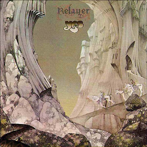
The typography lecture threw up some interesting fonts, during which I mentioned the artist Roger Dean. There are some of the Yes album covers which he designed below.

Monday, January 01, 2007

I'm InDesign

Within hours of finishing college for this semester, I was back to working on outside projects. Having had to cut back on these due to the approaching deadline day, I had a backlog of movies to create, as well as the Auto Sim Sport article.

I had been creating this article for several reasons. Firstly, I wanted to learn how to use InDesign, so that I could see if it was a marked improvement over PageMaker. I actually found it easy to pick up, as a lot of the controls which we use when putting the assignment into the template were available in the program too. I did actually plan out the article to an extent, by brainstorming what people would want to know about Photoshop, and what problems they were likely to encounter.

Actually writing the tutorial was all done on the fly. This is to say that I made the product, and wrote steps on it as I went. I had to remember that my target audience (which was Photoshop novices) would not have any knowledge of how the program worked. This lead me to creating a step by step guide, telling the user click for click what they had to do, and warning them of simple mistakes they could make.

I found that the photo restoration and banner design tasks which we did in class helped to highlight common problems people would come across, which made me aware of how different people interpret information.

As I enter the final stages of completing this document, I feel that I have created a professional looking piece of work, especially considering that I started it before we had looked at PARC and had the lectures on typography. As with any project, there are areas where improvements could have been made. Most notably, I think that my choice of fonts could have been better. I should have chosen a lighter font for the steps, and maybe highlighted notes in a different font. At least I can say that the choice and use of fonts is consistent through the document, having set up certain styles for certain parts of the document.

As the document is around 103 pages, with a few small areas to finish, I will want to know if my effort has been worth it. I may set up an e-mail account so that people can send me feedback directly related to the article, so that I know which areas could have been better, in case I decide to do another tutorial.


As I look to starting the second semester, I am starting to feel more anxious about the result of my last two assignments. I feel that they went more smoothly than the first assignment, but that does not in any way mean that I will have met all the right criteria to get a pass. I am also not looking forward to actually creating my website, as I have no experience other than this blog in web authoring. I am hoping that the tutorial will outline exactly what I need to do, and that Dreamweaver is relatively intuitive to use. I don’t usually look forward to the process of learning, but I can’t wait to gain the skills. I guess I’ll just have to endure one to be rewarded with the other.

I have recently been toying with the idea of buying a digital SLR camera. I don’t know weather this would be a worthwhile investment, or if I’d just spent my time taking pictures of the cat. I have been looking at the Deviant Art website, which contains a huge archive of peoples work, from a variety of media. This also contains web layouts which people have uploaded pictures of, and would make great inspirational work for sketchpads. I enjoy doing image manipulation, and a digital SLR would open new avenues for graphical work.

A happy new year to all avid readers of my blog, and I hope that 2007 brings as good a fortune as the back end of 2006 did. I will keep you informed of how the magazine article goes, and possible professional work (for real wonga!) which I may be doing in the future.

Friday, December 22, 2006

Semester 1 Review

Now that I have completed the first semester of study for the course, I can look back and evaluate how it has gone.

The first couple of weeks were difficult for me, as I struggled in the past to settle into new courses and new routine. I quickly found that Steve had engineered tasks to help us fit in over the first few weeks, and I think this helped everyone a lot. It took only a few weeks for the class to feel like one tight unit, and I feel this has really helped the stability of everybody’s learning.

I think that I learn a lot about working with people from the first few tasks on the course, as it got me talking to people and discussing things in a way I hadn’t done so much on previous courses. When it came to starting the first assignment, I thought that it was going to be a daunting task. Using unfamiliar programs was hard getting use to at first, and the idea of having very strict rules for handing in the assignment formatted in the correct way was also a new challenge for me.

At some points during the first assignment, I felt that with some tasks I wasn’t sure what I was supposed to be doing. I soon discovered from talking to others that these grey areas were being experienced with everyone, and they were also willing to discuss them with colleagues. This reassured me that I wasn’t the only one having to battle with making crucial decisions and then having to justify them.

When it came to handing in the first assignment, I felt fairly relaxed. I had managed either by skill, but more probably luck, to leave myself enough time to get all of my documents together. This left me with only a few small tasks to do on the final day before deadline, which I completed easily within the time limit. Although I had got everything done, I still felt anxious about getting all the technical parts of the assignment correct, something which I still seem obsessive about even now. Knowing that everything has to be right in this before anything else is assessable is still quite a challenge.

I was very pleased to have passed the first assignment, as I had expected that I would have made silly mistakes somewhere, or that I had not mentioned something crucial to pass the assignment. As soon as this assignment was out of the way, I had another two to do over the next few weeks. I found this a bit demoralising, as I knew things such as time management hadn’t been so good in the first assignment. This made me concentrate of getting it right this time round. Creating an overall plan for the run up to Christmas really helped me visualise what I needed to do and when, and started to relieve me of some anxiety.

Approaching the end of the second assignment, I could look back at how I had progressed from the very start of the course. I found that my design work was many times better than it was only a few weeks before. Any work I have done outside of college has also improved, as I now know to look closely for mistakes, and how to design in a way which is clear to understand. This is a massive improvement over what has only been a couple of months, and I think this will only get better as the course continues. I now have the confidence to try other programs, such as InDesign and Premiere, and apply the skills I have learnt at college when using them.

Looking back at my Formative Statement, which is the very first blog entry, I only really mention being able to use Photoshop. I can now add many other programs to this list, some of which we have used on the course, and other which I have used outside. I also mention that I would want to be a freelance designer. I wouldn’t say that I have completely gone off this idea, but I find working with people on the course adds a lot to the experience. It allows me to see other ideas and hear other opinions, which can improve my work.


If someone had said to me a year ago that I would be doing a course which I would enjoy, make lots of new friends and actually be able to cope with it all, I would have never believed them. A couple of months on this course has taught my infinitely more than I would have learn at university, which now looks farcical in comparison. As for the future, I just hope that everything from the first semester will continue to improve. There isn’t a single element of the course I haven’t enjoyed (except maybe presentations!) and I hope that this is a trend that will continue when we return after Christmas.

Thursday, December 14, 2006

Keep on Plowing

As the deadline is only a week away, the main objective is to get both A3 and A4 up to submission standard. After last week’s despair at not being able to design a decent website layout, this was one of the main tasks of my self study time. I looked at Steve Krug’s “Don’t make me think” book, which clarified what I needed to do for my design. I went to work in my sketchpad, and made a substantially better design than I had done previously. My design can be seen below.

In Wednesday’s lesson we had a production day, where I churned out substantial parts of my project, including the feedback form and site structure diagram. I feel that these both looked radically different from the first project, and that I’m becoming more of a designer each week. I felt proud that I overcame problems from last week, and created results which were far better than I could have expected. I hope that when it comes to marking my assignment, Steve will also notice the improvement in quality over A2.

Thursday was all about the template. Although most of A3 had been put into it, I still had fiddly parts like bullet points and captions to put in. A4 is currently being put into the template, and I hope to complete it over the weekend. My aim for the current week is to get everything ready to hand in on Wednesday, so that I can spend the day checking my work for any silly mistakes.

I think that my time planning has improved a lot over the A2 assignment, but I still do not feel as though it is coming naturally to me. I believe that with the production unit next semester I will struggle to learn Dreamweaver, as I have absolutely no experience with that program. The only way that I will be able to pick it up is if I put in a lot of time learning the program, and following tutorials on books so that I will feel more comfortable with using the program.

Recently I have been getting into print based design more than the web design side of the course. I enjoy the tangible element of print design, rather than the web design which I feel has less creative scope for me at the moment. As I am currently making a document for print in my own time, and have been collecting print resources, I feel that this is the direction I am currently heading in. This could easily change of course, as we start the web building unit after Christmas. I have enjoyed the A4 assignment task 2, and think I have learnt alot of skills from it by putting PARC into practice. My banners can be seen below.

The feedback groups for after the Christmas break have been decided. I am working with Scott and Mihrad, which I am very pleased about. I feel that Scott can bring an element of professionalism to the group, which will add an interesting new angle. I am excited by working with Mihrad, as he is a fellow Photoshop fan, and after looking at his banner designs I think that I can learn a lot from him.

Due to so much time being dedicated to the project, there isn’t a whole lot of outside work being done. However, avid readers will be interested to know that the Tony Benn website creator did get back to me (after a wait of several weeks). He basically said that he uses the Lycos web design tool, which is rather limited. He asked if I could give him some advice on how to make the website better. I have not got back to him yet, but will aim to do so over the weekend.

My confidence has certainly improved over the past week, and I am now starting to see the improvements in my design skills. I believe my outside projects are allowing me to become more familiar with the considerations which are being made in every piece of design work. I can not only see what decisions other people have made in their designs, but what aspects I can replicate in my own work. I’m hoping that this new level of confidence will show in the quality of my assignments. Roll on deadline day!

Thursday, December 07, 2006

The older I get, the better I was

This week I seemed to spend more time learning what I couldn’t do, rather than learning how to do things. On Wednesday, I had to create the design of my website on screen. This would have been an effortless piece of work, had my initial design been any good. As I have never made a website before, I really have no Idea where to start. I don’t know the limitations of the programs, what people like/don’t like, or indeed anything to measure the quality of my website.

My design soon changed when nobody liked either the colour scheme or the layout. At this point, I really couldn’t care about designing a decent webpage. It seemed to be pointless for me even attempt to do so, as there was an immense amount I didn’t know, and everything I could think of was quickly resigned to the bin. I simply cannot design something for limitations I don’t know, programs I don’t understand, made out of languages I haven’t ever written.

I really don’t know what I can do to fix this, and to top it all off, I have to be able to replicate it in PageMaker. Having recently converted to the vastly superior InDesign, PageMaker isn’t so much a step down, but a vertical drop of a few thousand metres down. I will need more than Christmas to replace the hair being pulled out using this program.

On Wednesday, we continued with the much more pleasant A4 assignment. Steve made us create thumbnails under timed conditions, so that we would put ideas straight down rather than thinking about what we were going to do. I found that when the time got down to 30 seconds this exercise became pointless, because with so little time to think of something and get it down on paper that it just looked like a incomprehensible scribble, which isn’t really ideal to work from later on. After this was done, we drew up our best designs in neat. I felt that with the 3 minute time limit applied, it was still not enough time to do it to a standard I would be happy with. It almost feels like cheating because it takes so little time.

Doing all this quick design work reminded me that my artistic background was a very different place. In art, you can literally spend hours, days, weeks, even months creating one piece of work. Below I have posted a picture of a picture I drew in the first year of A-level. A picture such as this would have taken any number of false starts, reiterations, and several weeks just to mentally prepare to draw it. Although it’s rather damaged by time and PVA glue, its still one of the better drawing I have done.

This certainly isn’t the kind of detail Steve means when he says “neat”. Although I was never a good technical drawer, as my picture shows, it was always a good lesson in attention to detail. I believe I can spot infinitely more mistakes in it than anyone else, an important skill for any designer. Can I ever reach the same error detection that I learnt in Art?

I left on Wednesday feeling exhausted and frustrated. Everything I seem to be attempting to do is not good enough, but I can’t see any way of making it better. I feel as if what I am naturally good at isn’t being used, and that I am being shoe horned into designing stuff which I have no idea about. The integrity of my work is diminishing quickly, as is the faith in myself that I will at some point be able to design well. Do I really have what it takes to get through the course?

Strangely, this week has not all been about failure and frustration. Over the last weekend, I had some extremely good news, which heralded the first piece of professional /semi-professional piece of work which I will be undertaking. I emailed an online magazine called Auto Sim Sport about a tutorial on skinning which I have been writing in my spare time over the past few months, using InDesign. I though it was a long shot that I would be able to get my piece of work to tag along with this magazine.

I e-mailed the editor of the magazine and showed some screenshots of how the tutorial looked so far (shown below). To my surprise, I received a reply the next day asking to get it ready for the January issue. I still cannot believe that something I have designed will be distributed to thousands of people! It looks like its going to be a busy Christmas for me, as I will have to finish the tutorial which has been neglected for weeks due to assignment work. I believe this marks the first step on a long journey, a journey which will hopefully include passing my HND interactive media course.

Thursday, November 30, 2006

Ram raiding Photoshop

This week was all about work, work, work. The majority of Wednesday was taken up with creating content for the A3 project. I had grossly underestimated how long it would take for me to do this, so as well as doing it all day; I spent a good part of the evening finishing off content.

As I had forgotten to save my image compression essay onto my flash drive, I now have this to finish off. It was frustrating that I could not finish this off, so I will have to time plan to do this sometime for this week. I still managed to fill up my study time with reading through my sketchpad, and gathering inspirational pieces, so maybe this was a blessing in disguise.

On Wednesday morning we had a lecture on typography. I found this very interesting, as a lot of the terminology I had come across in InDesign and Photoshop. A lot of the conventions, like only using display fonts for titles and headlines were common sense. Aspects such as the different width fonts that could be used were new to me, and I will be using these for the coming projects.

On Thursday we started, at last, to use Photoshop. Our task was to repair a damaged photograph, and Steve gave us some pointers on where to start. Interestingly, he did not recommend using new layers for each part of the picture when it came to colouring. This is not how I would have approached it, because I think that using more layers does allow you to readjust or even delete things if they go wrong. I understand that it reduces the file size, but .psd files are always substantially larger than their output files anyway. That’s just my two cents though, and maybe my opinion will alter as I become better at this new artistic approach to Photoshop. My efforts, as they stand now, can be seen below.
Throughout the day I enjoyed working with Photoshop, but also enjoyed discussing the progress with my colleagues. As I am currently making an unrelated tutorial on using Photoshop, it gave me an insight into what problems people come across when using Photoshop. These are usually simple things such as trying to edit something when the marquee box is still present on screen, or having the wrong layer selected.

For self study this week, I will be finishing off my compression essay, and working on my Photoshop picture. I am going to see if using my graphics tablet makes it any easier to use (if I can find any spare USB sockets that is) and I will also try changing the levels setting. I think this is the key to creating a good restoration, as I found mine was too dark and therefore lacked detail. I believe if you get this right, then you restoration will be a lot better.

Thursday, November 23, 2006

Hi, my name is Julian; this week’s blog is on…

Presentations. On Wednesday morning, we were given a lecture on the correct presentation techniques. I already knew that a conversational presentation style worked best for me, as I have done presentation in English and Business studies in the past. This presentation, however, would have to be a lot more professional than that. At this stage, I was feeing confident that I would be able to produce a presentation, but on what, and to whom I would not find out until later.

We were each given a colour to research, and had a partner to work with. I was given the colour blue, and had to work with Chris Towell. I felt comfortable working with Chris, as I was in his feedback group in the first assignment. I believe that this allowed us to criticise each others work without fear or a negative reaction. This certainly made the process easier, and we collected enough information to give us some food for thought.

Despite blue being one of the primary colours, and one of the most popular as our research showed, there wasn’t a massive amount that could create a relevant presentation. I thought that some of the information was hard to fit into a web design context, but managed to draw out issues such as the symbolism of blue, and what connotations it creates. In my presentation, I made these the key areas which I would talk about, as I thought that the audience would find this most relevant.

Apart from creating our presentation, we also had to make a hand out sheet that was to be distributed at the end of the presentation. I believed that a very simple design covering the key parts of the presentation plus additional reading was the best way to go about this. My sheet was simple, but neatly laid out. However, I think that if I did this again, I would have been more ambitions with my design. We are, after all in a creative, communication industry.

After a quick lunch, Chris and I returned to the room. This gave us ample time to read through each other’s slides and handout sheet. This is something that I have started to do more often with classmates, as other people can pick up on discrepancies you may have missed yourself. Chris found that some of the font sizes on my slides were inconsistent, and these were swiftly put right.

At this point, I was feeling confident that I had everything ready. Although I had found the research quite tough to do, I had enough information on my slides and my handout sheet to give a good presentation.

At one o’clock the whole class went down to the refectory to wait to be called up to the room. I tried my best to rehearse my presentation in my head, and thought that I would easily fill up the time with my slides. Once people started going up to do their presentations and returning, the tension started to rise. It was an awful feeling to see people coming back from the classroom with clear signs of relief on their faces as they had got the presentation out of the way.
Word quickly got round that the only people we were presenting to were Steve and Diane. I felt that this was actually tougher then it would have been if we were told we had to present to the class. I don’t really know why this is, possibly because it felt more like a formal assessment rather than a lecture style presentation.

Chris was the first of the two of us to be called up to do his presentation. I feel that this put more pressure on me because I felt mine had to at least match the quality of his. I was the next one to be sent up to the room. This is when the tension really started to mount. Every step that I got closer to the room, the nervousness increased ten fold.

I could not understand why I was so worried, I thought to myself “this really shouldn’t be worrying me, but it is”. In the past, I have been quite relaxed when doing presentations, as I was in the company of people I had known for years. This was very different.

I entered the room, and said as little as possible, trying to keep the professional feel as high as I could. I do now think maybe if I had been a little more conversational it would have helped me to relax.

Thankfully, my file was still on my data stick, and hadn’t vaporised. I began my presentation and the time flew by. During it, I felt my voice warbling, which is always embarrassing and a confidence destroyer. I also started to stumble over my own words, which I hadn’t experienced before. This clearly marked this presentation as a cut above the rest, even though nothing really important was resting on the outcome.

At the end of the presentation, I was given feedback from Steve and Diane. To my amazement, I had overrun by a whole minute, but Steve had not stopped me because he said he was enjoying my presentation so much. This surprised me, as I thought the stuff I had researched was not of the highest quality. I was also waving my arms around too much, like some kind of traffic warden. This is obviously something I will have to stop doing in the future.

Overall the feedback was good. I do feel in some ways that I needed to control my anxiety more, which would have improved the rapport I could have created with the audience. I also need to learn to understand how time seems to become a lot shorter when you are doing a presentation and I should rehearse it more before I stand up and start presenting.

This was the first piece of presentation I had done since my initial interview with Steve. I felt that because I was in control of the subject matter at the interview, I could attenuate my knowledge because I felt almost an authority on it. With my presentation, however, I was given something which I had to research and present on, and this lack of control made if harder for me to have confidence in what I was saying.

I believe in the future I should learn the ad-lib parts better from the research I gather. This will allow my presentation to be more concrete. I know in myself that I like to go into detail about how things are done, as I like to give people reassurance that they are doing or feeling or thinking the right things. These are certainly considerations I will make for the next presentation.